
The color of fruits in photographs and still life paintings
Details
Abstract:
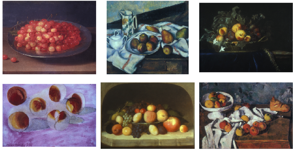
Still life painting comprises a wealth of data on visual perception. Prior work has shown that the color statistics of objects show a marked bias for warm colors. Here, we ask about the relative chromatic contrast of these object-associated colors compared to background colors in still life paintings. We reasoned that due to the memory color effect, where the color of familiar objects is perceived more saturated, warm colors will be relatively more saturated than cool colors in still life paintings as compared to photos. We analyzed color in 108 slides of still life paintings of fruit from the teaching slide collection of the Fogg University Art Museum and 41 color-calibrated photographs of fruit from the McGill data set. The results show that the relatively higher chromatic contrast of warm colors compared to cool colors was greater for paintings compared to photographs, consistent with the hypothesis.
Thorsten Hansen1 and Bevil R. Conway2
- Department of General and Experimental Psychology, Justus Liebig University Giessen, Giessen, Germany. Thorsten.Hansen@psychol.uni-giessen.de
- Laboratory of Sensorimotor Research, National Institutes of Health, Bethesda MD, USA. bevil.conway@nih.gov
Other Resources
Explore other related resources and data that you may find it useful.